Best practices for onboarding, upboarding, and offboarding users

The first few minutes after someone installs your extension can be critical to its success. Your new user needs to know where to start and how to use the features of your browser extension.

A Think Aloud User Research Study, conducted by Mozilla in August 2018, found that poor post-install tabs can erode any trust people had gained in an extension from its addons.mozilla.org listing. So much so, that in some cases study participants wanted to immediately remove the extension. The research also found that too much information or protracted setup requirements can have a similar negative impact on people’s perception of an extension.

The best extensions provide people with just the information they need to get started, without requiring too much time or effort for set up. Equally, if the extension has any limitations, these should be mentioned during installation to avoid unnecessary support requests or, worse, poor reviews.

However, engaging with people and keeping them informed isn’t just about the first few minutes after installation, it also applies when you upgrade your extension and even when the user removes your extension.

Onboarding

A good onboarding experience is essential for every browser extension and is not hard to do. You can onboard people through a new tab or popup window.

Detecting installation

You can listen for your extension’s installation using runtime.onInstalled as follows:

browser.runtime.onInstalled.addListener(async ({ reason, temporary }) => {
  if (temporary) return; // skip during development
  switch (reason) {
    case "install":
      {
        const url = browser.runtime.getURL("views/installed.html");
        await browser.tabs.create({ url });
        // or: await browser.windows.create({ url, type: "popup", height: 600, width: 600, });
      }
      break;
    // see below
  }
});

Onboarding page content

Your onboarding page or popup should provide the essential information people need to get started. The content should, therefore, be brief and to the point. If your extension has many features, provide a separate help guide. The page should also complement the details provided on addons.mozilla.org, not repeat them in detail: the focus of the startup page should be how to use your extension, rather than what it does.

Consider adding the following information to the onboarding page, in roughly the order it’s listed below:

  • Your extension’s name, as it appears on addons.mozilla.org, along with its icon or logo.
  • A brief overview of your extension’s features and functions, enough information to reassure the new user they’ve installed the right extension.
  • Practical information on how to use the extension, including details on how to access its features from a toolbar button, address bar button, sidebar, or context menu. Include at least one simple activity that the user can do immediately. If your extension has many features, focus on providing instructions for the things users do first.
    Tip: Provide an introductory video: showing someone how to use your extension can be a lot more effective than telling them. If you do create a video, provide closed captioning or a transcript to make sure it’s accessible.
  • If your extension features can be customized, explain the options available and provide a link to the settings page. If settings are a significant feature of the extension or the range of settings is large, don’t expect your new user to be happy working through several pages of settings now: consider providing quick links to specific configurations.
    Tip: Use runtime.openOptionsPage() to open the settings page.
  • If the user needs an account for your web service to make use of the extension, provide them with a link to sign in or register.
  • If your extension has paid features, let the user know what those features are and how much they cost. If you have tiered payments, provide a comparison chart or link to one on the extension’s website.
    Tip: If you fund the extension’s development from donations, now is a good time to tell people and provide a link to the donate page.
  • Provide links to additional information such as the extension support page, help guide, tutorials, and alike.
    Tip: If you have other extensions, give them a mention.

Having read your onboarding page, your new user should be confident about starting to use the extension immediately and know where to go if they need more information or support. If possible, they should have had some hands-on experience with key features.

Page design

Pay attention to the design and style of the page. Keep it consistent with your extension’s web page and AMO listing. For example, use consistent icons and colors. This helps reassure your user that they’ve installed and are using the right product. Follow the Photon Design System, where this doesn’t conflict with your product’s design.

Don’t include advertising on your post-install page. Ads can degrade people’s trust in an extension, draw people away before they engage with your extension, and create confusion about what extension has been installed among other drawbacks.

Onboarding page examples

Here's an example of a good onboarding page:
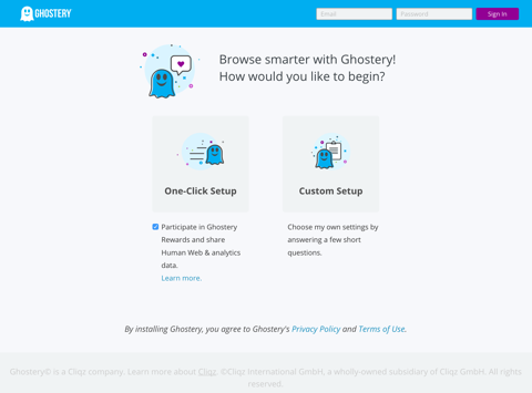
Example onboarding page that gives the user options for a one-click set up or the option to proceed to the settings page

Ghostery – Privacy Ad Blocker

As the features of Ghostery are mostly silent, this onboarding screen gives users two options for the initial setup: A simple one-click option and a link to the full settings so they can customize how Ghostery works.

Upboarding

When you update to your extension, take the opportunity to tell your users about the new features and any fixed issues. In addition to being an opportunity to engage with active users, you can also re-engage with people who may have stopped or never started using your extension.

Detecting an upgrade

You can listen for your extension’s updates using runtime.onInstalled as follows:

browser.runtime.onInstalled.addListener(async ({ reason, temporary }) => {
  if (temporary) return; // skip during development
  switch (reason) {
    // see above
    case "update":
      {
        const url = browser.runtime.getURL("views/updated.html");
        await browser.tabs.create({ url });
        // or: await browser.windows.create({ url, type: "popup", height: 600, width: 600, });
      }
      break;
  }
});

Tip: If your upgrade involves requesting additional permissions, see Test permission requests for details on how to test those changes.

Upboarding page content

Consider adding the following information to the update page:

  • A brief description of your extension. This should be enough so your regular users can identify which extension has updated and enough to entice lapsed users back to using the extension.
  • A list of the new or improved features or issues corrected in this update. Include information on how to find and use the new or improved features.
  • If any of the new features require payment to use, let the user know what those features are and how much they cost. If you have tiered payments, provide a comparison chart or link to one on the extension’s website. This is also a good time to request donations, remembering to add a link to the donate page.
  • Provide links to key information such as the extension support page, help guide, tutorials, and alike.

Upboarding page examples

Here are some examples of good upboarding pages:

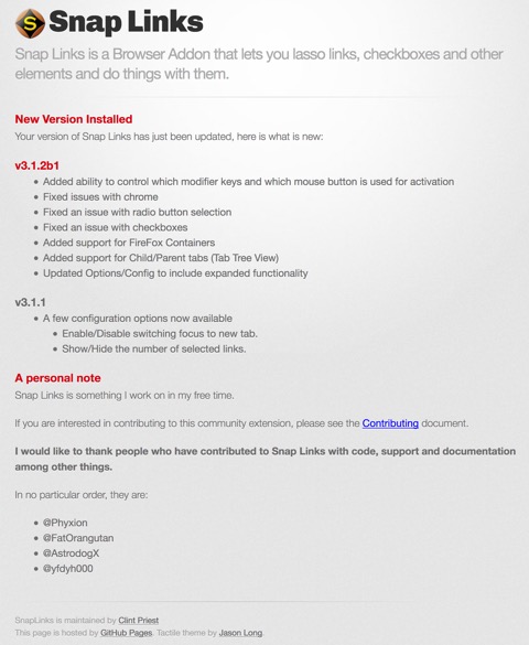
Example upboarding page that includes a summary of the extension's features, details of the improvements and updates, and a request for donations.

Snap Links Plus

This page provides a brief description of Snap Links Plus before listing the improvements made in the release. Clint, the developer, also makes it clear that the project is an unpaid personal one and provides users with details of where they can contribute. He also kindly mentions the people who helped create the extension.

Offboarding

When a user decides to remove your extension, don’t miss the opportunity to gather feedback on why the extension hasn’t worked for them: you may not be able to get this user back but, by addressing their concerns you can hopefully reduce the number of users who might remove your extension in the future.

Setting up an offboarding page link

To gather information from leaving users, you need to set up an external webpage and then specify this in runtime.setUninstallURL(). This page then opens when a user removes the extension.

Page content

Consider adding the following information to the offboarding page:

  • A “help us improve” message.
  • A survey about why the user is removing the extension. Offer them a list of the most likely reasons and an optional free text area to provide more details.

Remember to keep everything brief. A departing user is unlikely to respond to a multiple question quiz about why they are going.

Offboarding page examples

Here are some examples of good offboarding pages:

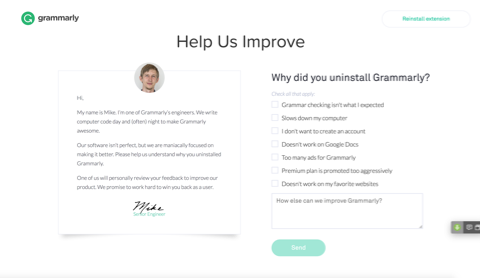
Example of boarding page with a "help us improve" message and simple survey with a list of reasons the extension is being removed.

Grammarly for Firefox

This page provides a personal message from one of the Grammarly developers, a short list of reasons why the user might be removing the extension, and a text box where they can provide more information.

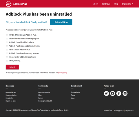
Example offboarding page that includes a reinstall button and request information about the removal with a simple questionnaire.

Adblock Plus

This page provides a link to reinstalling the extension, guarding against accidental removal. Then it offers a list of reasons why the user might have removed the extension, with the final option expanding into a textbox for details of other reasons. There is also a handy reminder that this information is sent to Adblock Plus and a link to their privacy policy.